Powered By Blogger

Saturday 15 December 2012

The Iron Man Part3 - Arms Legs,The Final Piece

The Iron Man

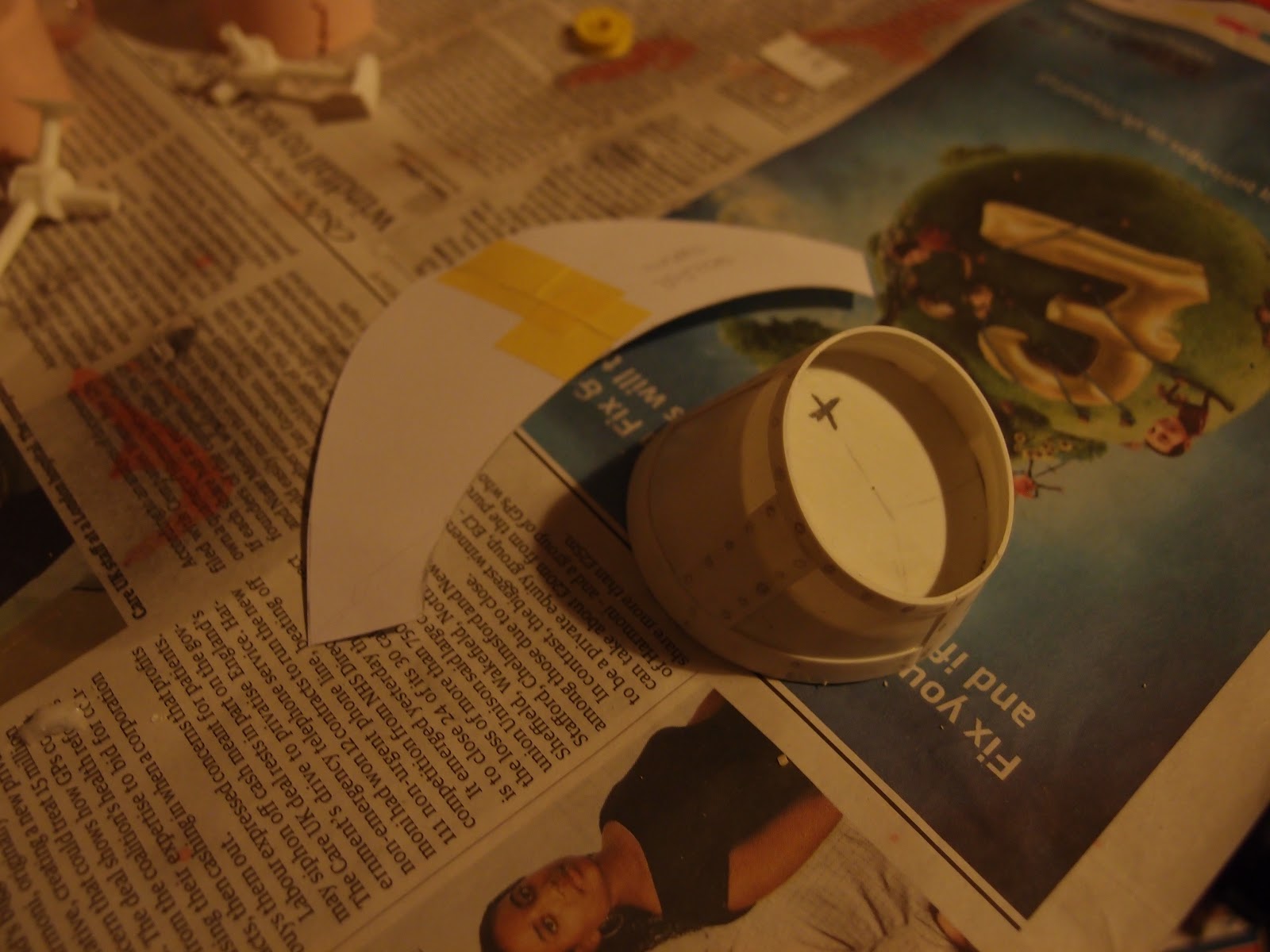
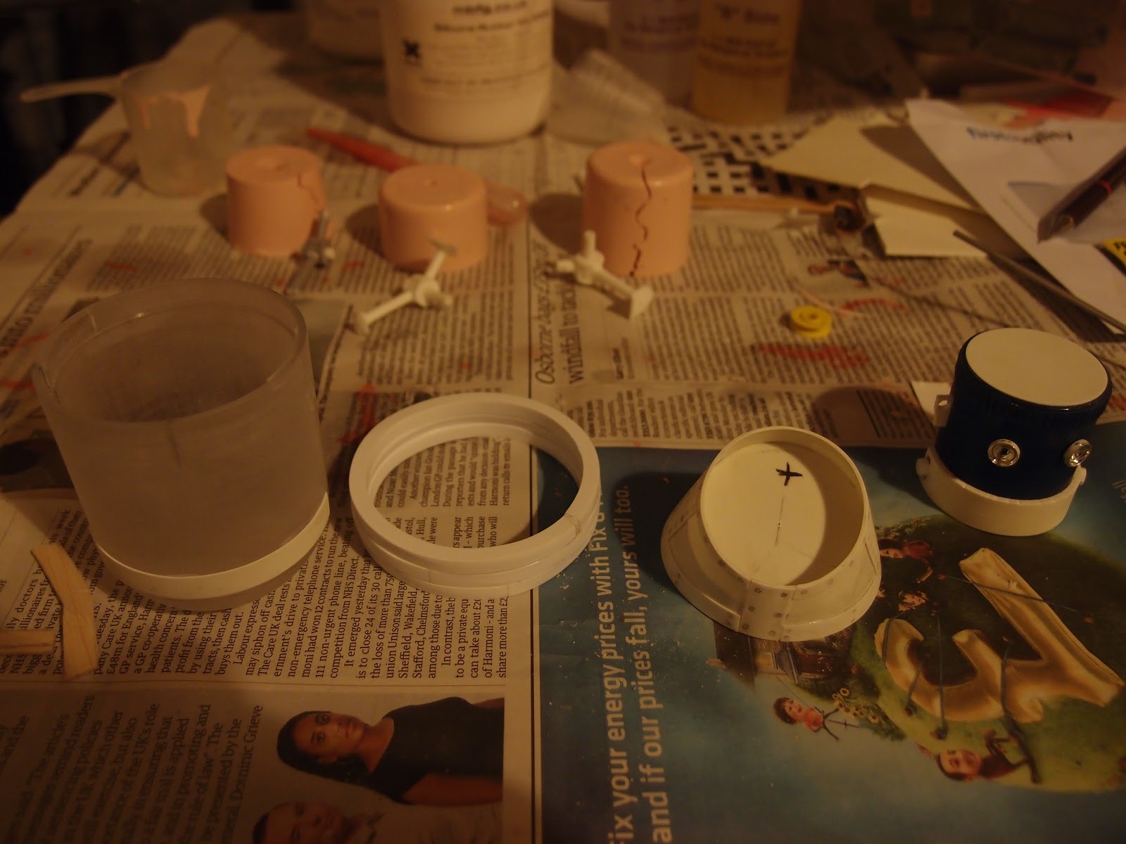
Once the torso and head were designed and built,it was time for limbs to be made. My intention was to stick with the"steam age" influence for his arms and legs,so connecting rods and simple hinges were the chosen forms.
 Fig 1. Torso with limb attachment bosses
 Fig 2. Digger style arms
Fig 3.Con-Rod thighs and piston calves

All the parts were Prototyped in Balsa foam from which Silicon rubber moulds were made,these were then filled with polyurethane casting resin to make the final pieces. the fore-arms and "digger" hands were made from plastic-card.
The Painting Process/Finishing

The figure was primed as 9 seperate parts Head,Torso,2 upper legs 2 lower legs 2 upper arms and 2 fore-arms with hands. At this point I discovered that Halfords brand primer does not like to adhere to Resin (it flaked off once dry!!) Therefore a specialist resin primer by Vallejo was used (after an extensive tooth-brushing of the cast parts first).Once the primer was dry,everything was sprayed a Mid-Dark Grey. At this point I embarked upon the dark art of weathering,adding dust rust and wear and tear to the figure,There is a Bi-Monthly magazine available devoted solely to this subject.

Fig 4. The Iron Man with rust,scratches and metallized highlights added.

Fig 5.  The hands received more extensive weathering. 

 I also realised I would need a companion for Mr Iron to give him scale and a little context,so a tiny Hogarth in Duffel-coat was made from Fimo and painted with acrylics.
The Iron Man. 
Complete with Battleship Chain "wings" on his back
His feet are supposed to look like Ingots of "pig" Iron.

So there it is! I hope you have enjoyed looking at the "build" progress and as always any comments or criticism's are welcome...

Ed Allen 2012 


Thursday 22 November 2012

The Iron Man. Part2 - Beginning construction

 Ok I said I would be going over RTV moulding and Resin casting..Well I decided just skim the subject coz it's..
A) More a technical discipline rather than an artistic endeavour.
B) There are resources on the internet where you can glean more/better info on this subject (just Google casting in resin).
The Masters(in grey)
and Casts(in white)

Assembled master and cast.
 Having decided I wanted to make my figure("Irons" from here on in) a pose-able figure, I would need multiple joints for hips,shoulders,knees and elbows(8 in total) the quickest and easiest way to do this was to make a "Master" and cast copies.Once a prototype hinge joint was made,it was split into its component parts and cast in RTV rubber,a pourable slow curing mould compound. Once the RTV had cured,Masters were cut from the mould. Polyurethane resin was used to make the joints I will use on "Irons" for speed and because the casts are single pour moulds they are also structurally stronger.
 I'm going to use a Bessemer furnace as a torso(see previous post),I decided to make a scale model of said furnace,and being a bit strapped for cash right now I rooted around the house for scrap(plastic) and any forms/shape that I thought would fit in with my design("Iron's" belly is a hangable Tent light,and his head is a base from a pencil sharpener). Necessity IS the mother of invention after all. 
The inspiration.
Rough Marquette Sans legs/arms. 

Torso and head construction.
The torso needs more work and lots of detail to be added before I feel satisfied,but watch this space as next time I will be making legs and arms for our hero..

Comment and criticism welcome :)
Ed Allen 2012

Tuesday 20 November 2012

The Iron Man. Part1 - Design

The Iron Man by Ted Hughes. A short story for children about a mysterious Iron giant roaming the English countryside,and a boy called Hogarth's fascination with said giant. A favourite book of mine when I was a child,that having re-read recently I still found charming now I'm a grown up.
 I decided I would construct an actual figure of the Iron Man in the style of an "action figure/collectable",this meant a character between 8 and 12" in height and painted to look like huge Iron/steel man.

I started by sketching various Iron men,not the muscles and spandex type of Marvel(TM) men but figures made of chunks of steel and scrap metal.
Random Iron Men


Bit more thoughtful Iron Men

After a little work with various solid forms I did what I should have done from the start,and researched Iron and steel properties and manufacture.
A Bessemer furnace(early means to make high quality steel)

The hay-days of steel and Iron were in the Victorian era,steam power,iron bridges,ships,trains,which led me to the Steve Jobs/Bill gates of engineering Isambard Kingdom Brunel.A real Iron Man!
I. K. B.
Which set me thinking
Behold! Furnace bellied Iron Man

I now KNEW I wanted a Victorian steam age feel to my figure. Now I needed to worry about construction,Will he stand up? can I make him pose-able? will my 2D designs look ok in 3D?
Hogarth and Iron Man.

Tune in tomorrow when I'll be ranting about RTV moulds and resin casting.

Comment and criticism welcomed
Ed Allen 2012

Friday 14 September 2012

You know what I did this summer?

 What I am posting today is a piece of work "evolution". From sketchbook roughs to finished piece. A process which many illustrators/creatives do not tend to divulge freely.
I have been reading Homers Odyssey over the summer,which begins with the sacking of Troy,If you are unfamiliar with the tale of the Trojan horse look here=>http://en.wikipedia.org/wiki/Trojan_Horse. This was where my initial inspiration ignited.
 The tale tells that,after besieging Troy for 10 years,the Greeks boarded their boats and seemingly set sail for home,leaving behind them,at the gates of Troy,a giant wooden horse. The Trojans dragged this apparent tribute within the walls of the citadel. Unfortunately for them,when night fell the Greek warriors hiding within,leapt out and took revenge on the inhabitants of Troy,murder,rape infanticide,desecration of holy sites,in-fact every war crime you might think of was perpetrated by the "Heroes of Greece" that night.
 On to the pictures..I started with the idea that any wood the Greeks could get would have to be salvaged from their own ships,and the wooden horse usually portrayed in art as a sculptural piece,would,I speculated, be made roughly from planks and nails.

Initial Horse thumbnails

My Initial designs for the horse look more dog or bull-like than "horsey".But I liked the many planks and nails appearance of the first sketches,so on I went...

My lovely horse(thanks Father Ted)

My next effort was more "designed" and horse-like.The reason the horse is kneeling and bowed is to give it an appearance of passivity or defeat. All the better to fool them cocksure Trojans. I felt I had a piece strong enough to work with. Following an extensive clean up in Corel Painter to remove the sketchbook crease-line and sharpen/redraw blurred elements of the scan,it was time to vectorise in Adobe Illustrator.

The Trojan Horse

 I used the "high detail illustration" preset from the live trace menu,then spent the next few days tweaking anchor points,once this was done I selected various Earthtone colours to fill in the myriad planks.
 In hindsight I should really have placed it within its own environment,to give it scale and an obvious context.

Ed  2012

All Images copyright Ed Allen 2012

Wednesday 18 April 2012

Can you say Pecha-Kucha? Character Development

Pecha Kucha is an informal fast paced presentation technique 20seconds on each slide 20 slides(or 10 in this case.I presented a series of slides on the development of characters for a children's book called "Sparky get's a friend" its about an bored old cat coping with a new kitten being thrust into his world by his owner.
The starting point.
Any journey starts with a single step or in this case with a blank page,the bane of my life,quick fill it with anything! Cats! Partially anatomically realistic cats,this didn't float my boat so a re-think was in order.

 Cat Re-work.
After taking a peek at Ali Grainey's Blog  http://www.drawarama.blogspot.co.uk/  I decided simplifying forms was the way to go,settling on a sausage shape for one character and a more rigid cone shape for the other.
personality and context.
Next I tried to breath some life and personality into my creations(in Frankenstylee) everything inhabits somewhere,even germs in a petri-dish have an environment.(context to you and me) I also started to figure out personalities and colours suited to each character too.
Environment and stuff.

"Sparky" re-design.
At this point,during a crit it was decided that Sparky needed to to be made to look more decrepit and old,to create more contrast to the kitten character,I floundered for a bit until one evening "Dads Army" was on the TV and BINGO!! Arthur Lowe fit perfectly with the character of old staid Sparky the cat.
More re-work and expressions too.
Now I felt I had 2 characters I liked to draw and could carry a story for me,from here on it was a matter of composition and making a "nice" series of drawings,oh and telling a story too.

What did I learn? 
Research research research!
Draw Draw Draw and when you think you've done enough draw some more!
Put your'e creations into their world,environment their interactions and (ahem)motivation.
Play with scale,colour,line qualities.
Google people who's work you admire in your chosen field of interest and see how they do it (thanks Simone Lia .http://www.guardian.co.uk/books/gallery/2011/aug/02/how-to-draw-bunnies-simone-lia and www.simonelia.com/).
Take advice and criticism wherever you can get it,(thanks to my tutors,Steve Wilkin and Chris Harper) take notes and mull them over at your leisure.


Ed Allen

Tuesday 17 April 2012

DD2000(Design Practice) Contemporary Exhibition-Manchester gallery

On Mosley street in the centre of Manchester away from the throng of shoppers and harassed office workers,there is an oasis,a cultural oasis.Within lies the bequests of what used to be Manchester's great and the good,a repository of the tastes of the local movers and shakers from the 17th to the early 20th century,Pre-Raphealite's,landscapes and portraiture abound. But this not what I have come to see,one wing of the gallery is dedicated to Modern and contemporary Art and this is what I shall be reviewing.
Upon entering this wing one notices a figure of perforated steel suspended above the stairway,this is a piece by Anthony Gormley entitled "filter",as with a lot of Gormley's recent work it's a piece based on a cast of the artist's nude figure.Some of his work can be very effective,less so this piece possibly due to it's placement or possibly because Gormley's figures are basically the same,just with a variation in construction methods.

Anthony Gormley's Filter.

For reasons of brevity I shall pick on the pieces that caught my eye . Micheal Craig Martin is a contemporay artist who is also an advocate of conceptualism,in the 1970's he produced a piece called "Oak Tree" which was a glass of water on a shelf,but next to it was a text asserting that the artist's intention is superior to the art itself.This is a concept which dates back to Marcel Duchamps Dada-ist piece "Fountain"of 1917(which was actually a urinal)
The piece exhibited here is "Inhale (yellow)" A large canvas of everyday objects painted in vivid colours,the black lines in the piece have  the appearance of being mechanically drawn due to their regularity.
Martin's conceptual approach was a big influence on Damien Hirst,Tracey Emin and Julian Opie.

Inhale(yellow) by Micheal Craig Martin.
Release is piece by Mark Francis that catches the eye because you know instantly what is about even though it is an abstract piece,it is a large monochrome canvas which though it was painted with acrylics has the appearance of a photographic plate.The image itself is of a cluster of short black bent rods with nodules on each end,are they sperms? are they invading viruses? and though they are in monochrome one gets the feeling they are of a biological nature,this may be because such things are always presented in an abstract way in the media anyway.
Release by Mark Francis

Peter C by David Hockney,this is an example of early Pop Art which is hung directly opposite a piece called Zephyr by Bridgitte Riley an example of Op Art,so called because it causes ocular confusion when viewed. Neither of these pieces could be described as contemporary today but both artists still work with Hockney recently having a retrospective and current exhibition at the National gallery in London. Peter C is a portrait on 2 joined canvases of a friend of Hockney's whilst at art college,Peter Crutch. Hockney had a crush on Peter who was by all accounts "straight",Unrequited love has motivated people to do many creative and destructive things,here it helped produce a piece of work that put David on the "art-map" before he had even left Art-School. 


Left: Peter C by Hockney. Right: Zephyr by Riley
I personally believe Brigitte Riley is one of the UK's most over-looked artists,her work has influenced both the work of fine-artists(Damien Hirst's Dot Painting's anyone?) and graphic designers. This piece is starting look its age,with the linen discolouring at the edges,yet this seems to add another dimension to the piece,It's fading waves of colours still make one feel queezy if viewed too long,there are not many artworks which you remember for there physical,rather than aesthetic effects.

To conclude,though the are non of the "Greatest hits" of modern/contemporary art in the exhibition(there mostly in Mr Saatchi's Gallery) there are lots of interesting modern works by significant practitioners in the world of Fine Art,and in the main gallery works by local artist Liam Spencer who seems to catch the sodium lights and gloom of Manchester perfectly. 

Ed Allen

Monday 16 April 2012

DD2000(Design Discourse). David Pearson & Jim Stoddart

This a rare interview to see http://www.gestalten.tv/motion/fully-booked,an interview with both the person who commissions art-work and the designer himself talking about the state of book cover design in the new publishing era. Jim Stoddart is the art director for Penguin books and as such is responsible for the "look" of their current run of products. David Pearson is a Graphic Designer and Typographer http://www.davidpearsondesign.com charged with the re-launch of Penguin's Popular Classics,Great Loves and Reference series.


To the right David Pearson's work.

To the left the "classic" Penguin Design.


Pearson has taken care not to make the covers too "trendy" as this would quickly date the appearance of the graphics on what are literary classics,he also revels in the lack of space with which to make an impact. David endeavours to set the book apart from the new world of E-books(kindle etc) by making a book a desirable object not just for its contents but also for its visual and tactile qualities. Penguin still publish books with it's classic cover design,which usually looked like the above image on the left,but it also makes these more desirable "designed" covers which are aimed at a visually discerning book-buyer who would buy a series of David Pearson designed covers because they would look good on their bookshelf at home.
Modern book design must also take into account that many books are bought from online booksellers where there is no tactile element and only the graphical qualities are on show,here it will not be possible to see if a book has an embossed or offset printed cover,Only the shapes,colours and typography sell the book(and of course the text within). It will be interesting to see where the E-book goes in the next few years,with the next generation of Kindles allowing Graphic elements to be displayed.
David's own publication Fully Booked deals with book cover and book design,many of the examples within probably fit more within the artist book genre,where content is subsumed to the overall design of the piece,perhaps this is where books must look to in the future,as objects for committed Bibliophiles.

Ed Allen

Tuesday 10 April 2012

DD2000(Design discourse) Cristoph Niemann.

Cristoph Niemann is an Illustrator/Graphic Designer from Germany who moved to the US in the nineties he worked extensively for the New York Times and the New Yorker Magazine, he has also co-authored several children's books.
A couple of Niemann's covers
The subject of his video on Gestalten.tv http://www.gestalten.tv/motion/christoph-niemann was not so much his working method as his philosophy of communication and role of an Illustrator in today's media.  How people relate to his work,weather it is possible to relate visually speaking,with someone on the other side of the world,a joke he says,is only a joke if your audience laugh. Cristoph believes insecurity is helpful in the work of any designer,it forces you to re-think and sharpen your work,this never being completely satisfied with your work philosophy,is extremely common amongst practitioners in the creative industries,he also states towards the end of the interview that the constant appraisal of one's own work can make the designer somewhat neurotic (that's our future folks, paranoid and disappointed.......joke!).
On the industry, Cristoph was adamant that his clients were key to his becoming a better illustrator/designer though he does say it is natural for the creative to bitch about the demands/constraints of the clients briefs,he enjoys the process of having someone to "bounce" idea's off, but I think this probably because he has had some very good art-director's to work with (I don't think the New Yorker Magazine employs crap art-directors). Speaking of which,Cristoph believes it important for the art director to KNOW their readers and what they will "get" and what they won't.


When Cristoph moved back to Germany he wanted to try new things (tiling bathrooms using the tiles like pixels to create pictures/patterns,making a book Illustrating life in New York using LEGO). He also began a weekly visual blog on The New York Times webpages http://niemann.blogs.nytimes.com/ on which he makes voodoo dolls,witty observations and visually dissects the ephemera of modern society,one of the side efffects of this weekly blog is some of the blog viewers believe Cristoph to be suffering from Attention Deficit Disorder or more bizarrely bladder problems,(Yank's eh). I heartily recommend it for its simplicity and creative use of the graph-chart.

Ed Allen

Sunday 8 April 2012

DD2000 Editorial Illustration part3.

How much do I admire the work of Noma Bar? let me count the ways...Trained as Hebrew Typographer(actually a Bachelor in Graphic and Typographic design) in Israel the country of his birth. Noma came to London in 2000. Not being able to speak the English very well,he says compelled him to communicate in another way, Pictograms.
Front cover of Negative Space.

A pictogram needs to to be succinct and obvious,yet there always seems to be an ambiguity in any pictorial representation. Noma uses the eyes desire to "find" a meaning in symbols to great effect in his portrait work.
Noma has been qouted as saying "I'am after Maximum communication using the minimum of elements".

Travel Pictograms.

Seldom using more than 3 colours/shades in his work,the lack of colour variation is a neccesity to keep the image "readable" I'm sure you could assemble the same images using collage elements but the result would be visually disparate.  His compositions ARE the picture,not just an aesthetic design choice but key to the construction of a recognisable portrait or idiomatic symbol,using key elements associated with his chosen subject,weather a person or an editorial brief to assemble a visual pun or satirical image.

Mr Allajimhdad and Mr Spock

Although Bar assemble his images with the use of computer software,this is only after many hours of sketchbook work,he lives in a flat overlooking a wooded area in London and spend up to 5 hours a day sitting on the park benches sketching life as it passes by. He stated recently in an interview in the New-Yorker that a portrait of Fever Pitch/High Fidelity author Nick Hornby required over 200 drafts before Noma was happy with the result. At first glance this may seem  like a lot,but the pare-ing down of an original idea into a succinct and coherent final image must require many hours of "tweaking".

Nick Hornby(left) George Dubya(right)

Some critics see Noma's work as little more than "logo's" for the celebrity age,akin to the Nike swoosh or the golden arches of Mc'donald's. I think this is a miss-reading of the images,yes they are easily recognizable(a feat in itself) but they also seek to comment on a subject purely using visual language. When given the brief of the Bush administration's complicity in the Abu Ghraib abuse scandal, not many illustrators
would have come up with something as succinct and sly as Noma Bar's response,perhaps it is too clean and too static for the subject matter but it works on the level of tie-ing the two elements of the story together into one coherent final piece.

Ed Allen

Wednesday 28 March 2012

DD 2000-The Fig Taylor Portfolio rules.

Recently the Illustration course had an informal lecture from the AOI portfolio advisor Fig Taylor,this was an eye-opening and entertaining talk on how to present your work to potential clients. Fig came across as no-nonsense and pithy,but also as someone who cares deeply about the Illustration industry and those who seek to make their way in it. What follows is a list of "The Rules" of portfolio construction,and getting jobs.

 THE PORTFOLIO:
-No sketches/life drawings. (we know you can draw)
-Don't get attached to old work. (even if it is good)
-Be honest with yourself. (be objective)
-Concentrate on YOUR strengths.
-Your Unique,show it!
-Don't do BIG. (A0-A1)
-Your portfolio should be relevant to the client (portfolio full of cats but your pitching to dog-owner weekly?)
-If you do 3D work get it Professionally photographed.
-Don't mix and match your styles. If you have 2 distinct styles get 2 portfolio,s. (and a split personality)
-Pieces should be finished.
-Don't put in work YOU don't like. (if the client likes it..you're fucked!)
-Include a variety of subject matter done in YOUR style.
-Take your sketchbooks in-case the client wants a shufti.
-ipad your stuff (you hear that? that's the future approaching)
-Don't present on a laptop PC coz they're shit.

THE INDUSTRY:
-The Art Director is always busy.
-Getting a face to face meeting is hard.
-Clients don't like risks.
-Assume you're potential clients are lazy and/or stupid.
-The client doesn't know you,so you will be judged entirely on your portfolio(for good or ill)
-Research your potential clients thoroughly.
-Don't E-mail them(you'll just get deleted/blocked)
-Write a letter to potential clients and follow up with a phone call.
-Editorial have very short deadlines. (bare this in mind if you take a month to finish a piece)
-Advertising pays well but it's high stress and you will need to work with a committee of meddlers.
-Graze all the magazines you can find to see where your style may fit in.
-There are over 5000 trade magazines. (this is a good thing)
-All publications need "A look" to distinguish them.(this is also good thing)
-Move to Australia! There's hardly any illustrators out there...

Got that? Good.
Fig also had a few anecdotes from within the industry about bonkers Illustrators("I only want to work for The Times or the Observer") and seemingly disinterested Art directors(Stressed out and tired is their lot apparently,bless em).
But It was good to hear that there is work to be had,you just gotta find it and pitch for it. Make sure your'e portfolio is up to scratch first though.

Ed Allen

Thursday 8 March 2012

DD2000 Editorial Illustration part 2


This short essay is a subjective look at the work of Geoff Grandfield http://geoffgrandfield.co.uk/editorial.html who is currently director of Illustraion and Animation at Kingston University in the UK. At first sight his work is reminiscent of the work of Saul Bass's film and poster work of the 1960's and the "Film Noir" cinematography of John Alton.
 Above John Alton
Below Geoff Grandfield
 Geoff uses a "chiaroscuro" technique which originated during the Renaissance,it literally means light-dark in Italian. The artist would work from solid black to pure white or vice-versa,within the image to create depth or to make the main focus of the picture stand out. "Google" Carravagio to see this technique executed  by a master painter.
 Geoff's editorial work can be seen in The Guardian,The Times and The Big Issue amongst others. His style of work is well suited to the small scale allowed in most newspaper editorial pieces,having both visual punch and wit which in itself is no mean feat to combine the two.His compositions are beautifully balanced with his use of colour being key to the overall impact of the images,primary yellows reds and blues predominate.

It's hard not to see a nostalgic influence in Geoff's work. The art of Saul Bass(1920-1996) who was primarily a Graphic designer but who also worked in film titles and posters seems to "channel" through Geoff's editorial work. I think the correlation of  film poster and an editorial piece is close. A poster needs  to entice someone to see a particular movie and hint at the films content/mood,similarly an editorial illustration must do basically the same thing to entice a reader to read what could be a dry editorial by the use of a single image.
  Film posters by Saul Bass
Geoff works in pastels and gouache predominantly using photoshop to digitise his images for transmission purposes, though he now says the use of photoshop is increasingly influencing the way he produces images.(a common tale from all arms of the creative industries). He is also known for his book-cover work,his style fits "noirish" subjects like a glove.http://causticcovercritic.blogspot.com/2008/10/grandfield-on-chandler.html
If you would like to hear more from Mr Grandfield on the subject of Illustration,I suggest you listen to this http://www.graphicdesignontheradio.com/ click on listen and select "The state of illustration" where you can listen to him,Roderick Mills and Darren Clifton discussing where illustration is likely to go in the next few years. A very interesting listen if you aim to work in the creative arena